Harvia – Let’s sauna
Harvia’s international growth was guided by a bold, unified visual identity. The iconic red logo — deeply rooted in the brand’s heritage — was preserved, while sub-brands, color, and imagery were harmonized into one expressive system.
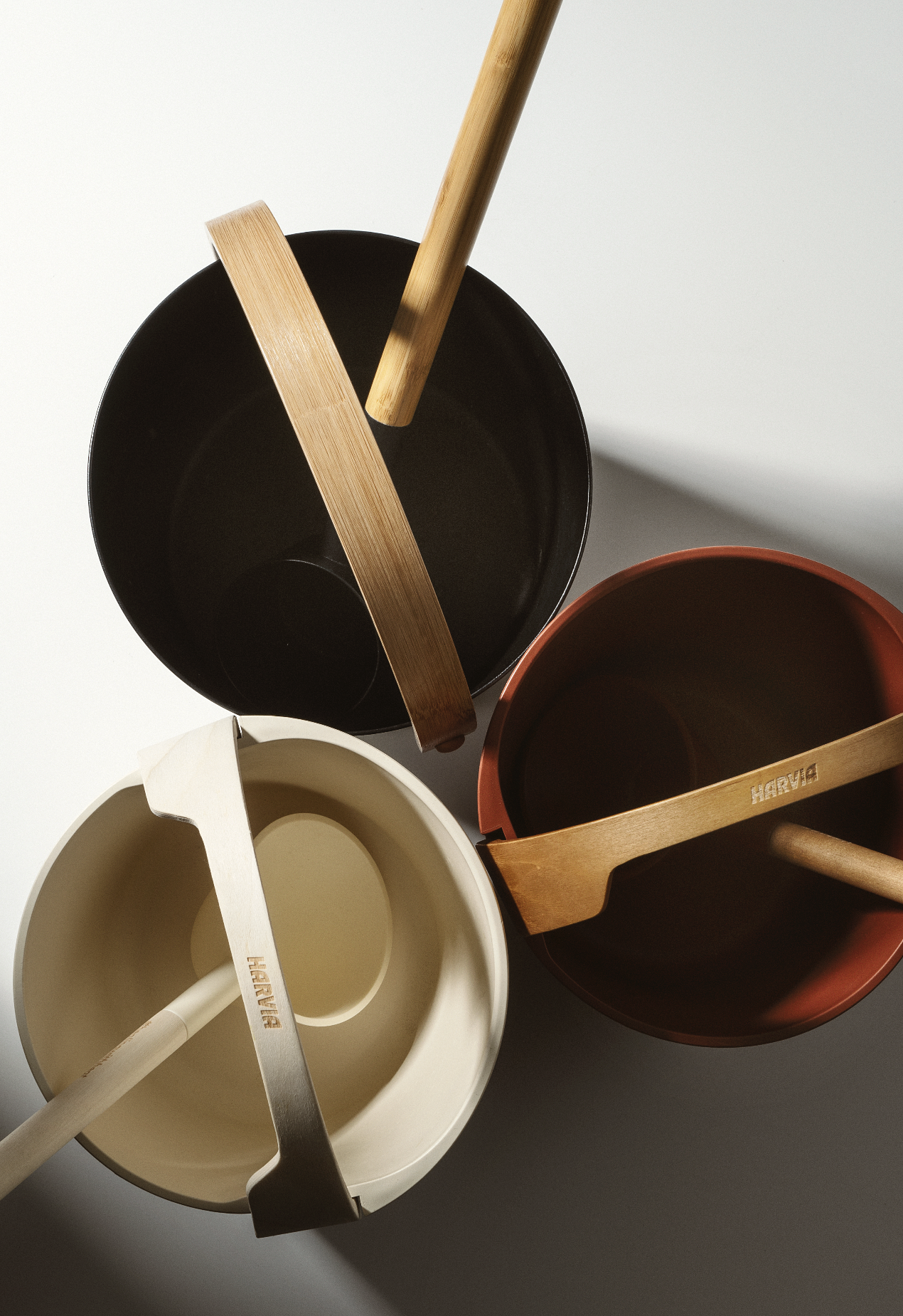
The extended palette builds around Harvia’s iconic red, complemented by warm, earthy tones and bright accents of orange, blue, turquoise, and green. Each hue reflects Harvia’s expanding world of experiences — from intense heat to cooling plunges and rejuvenating moments of rest. Together they capture contrast, vitality, and renewal.
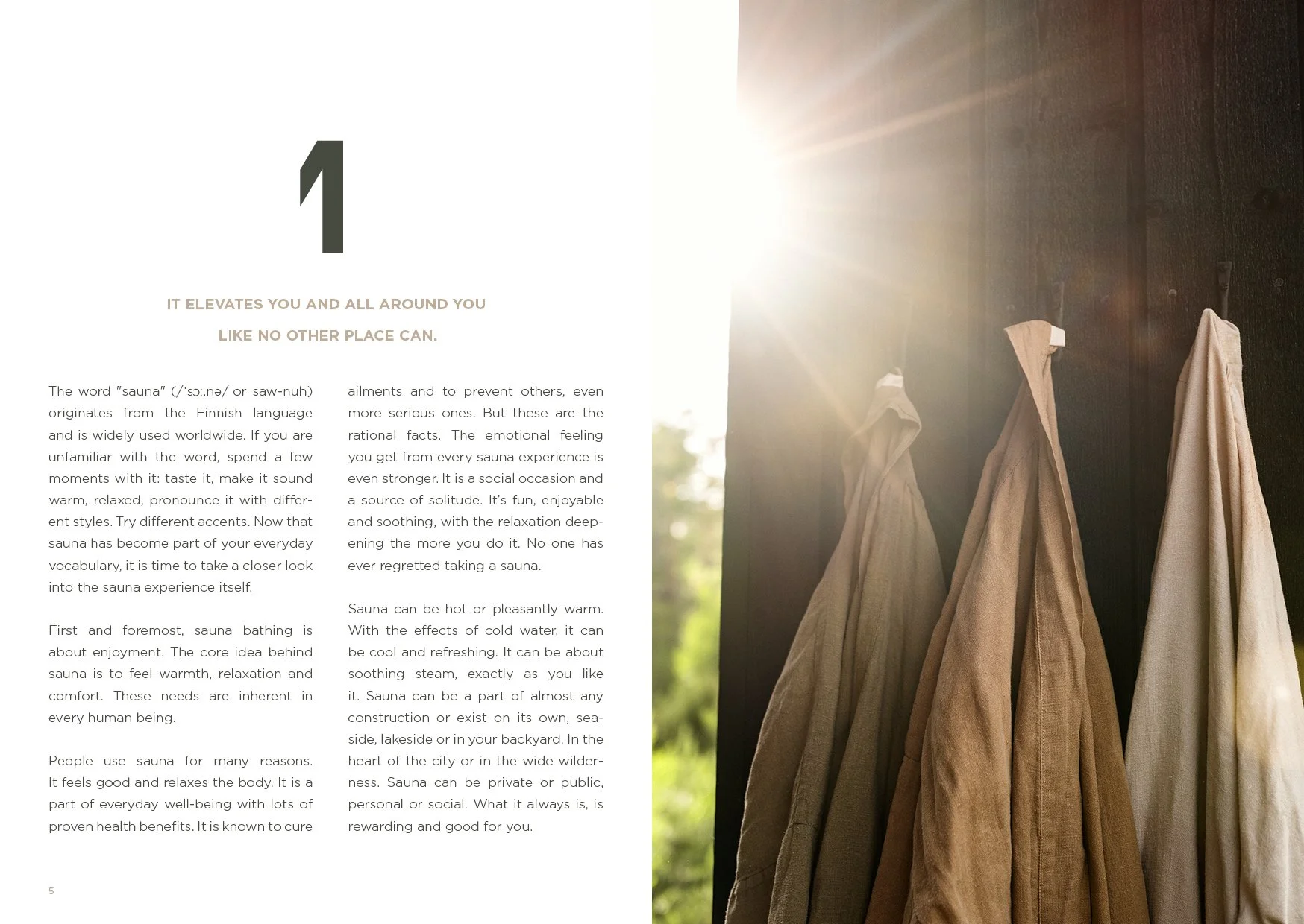
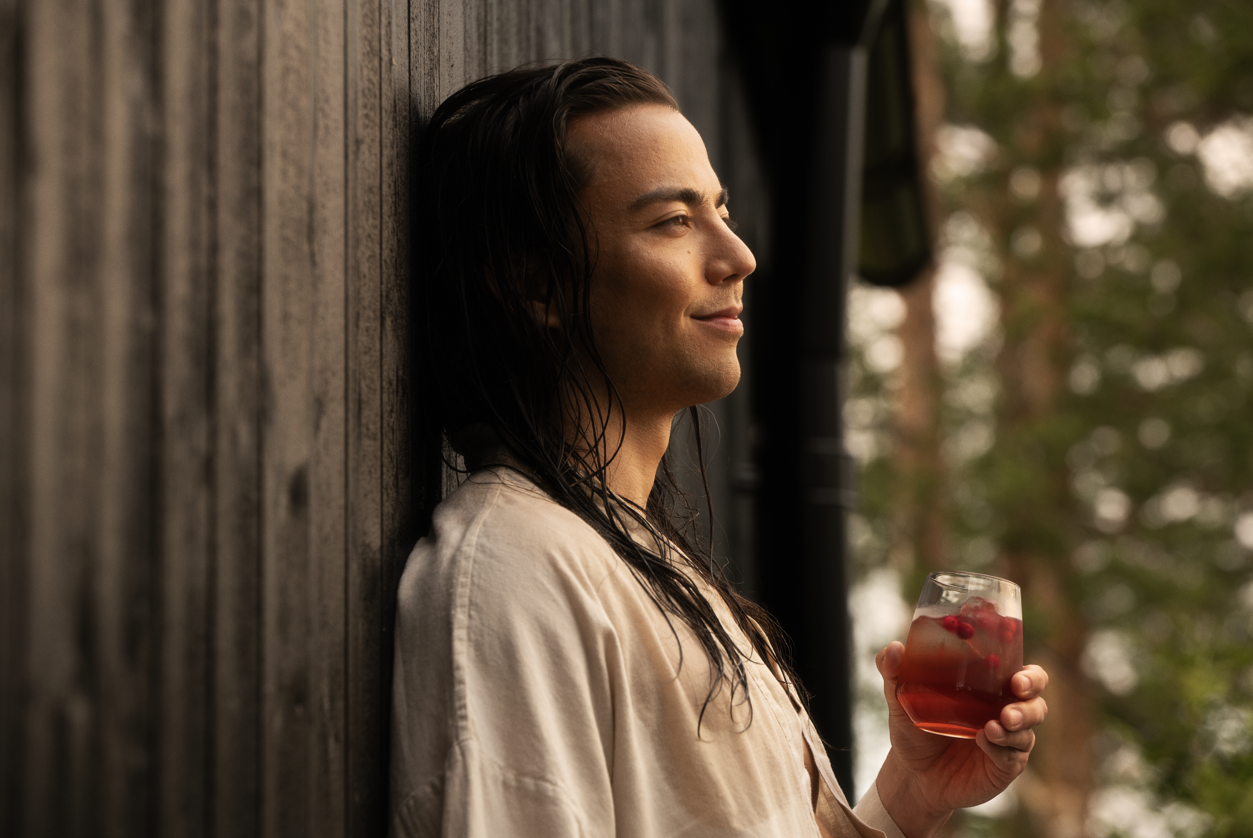
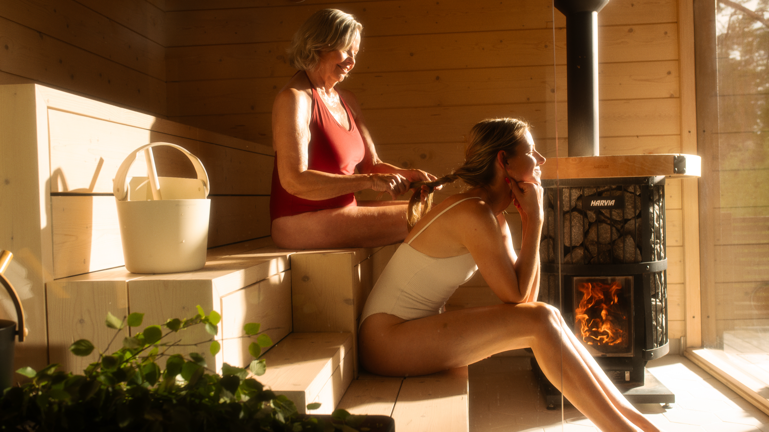
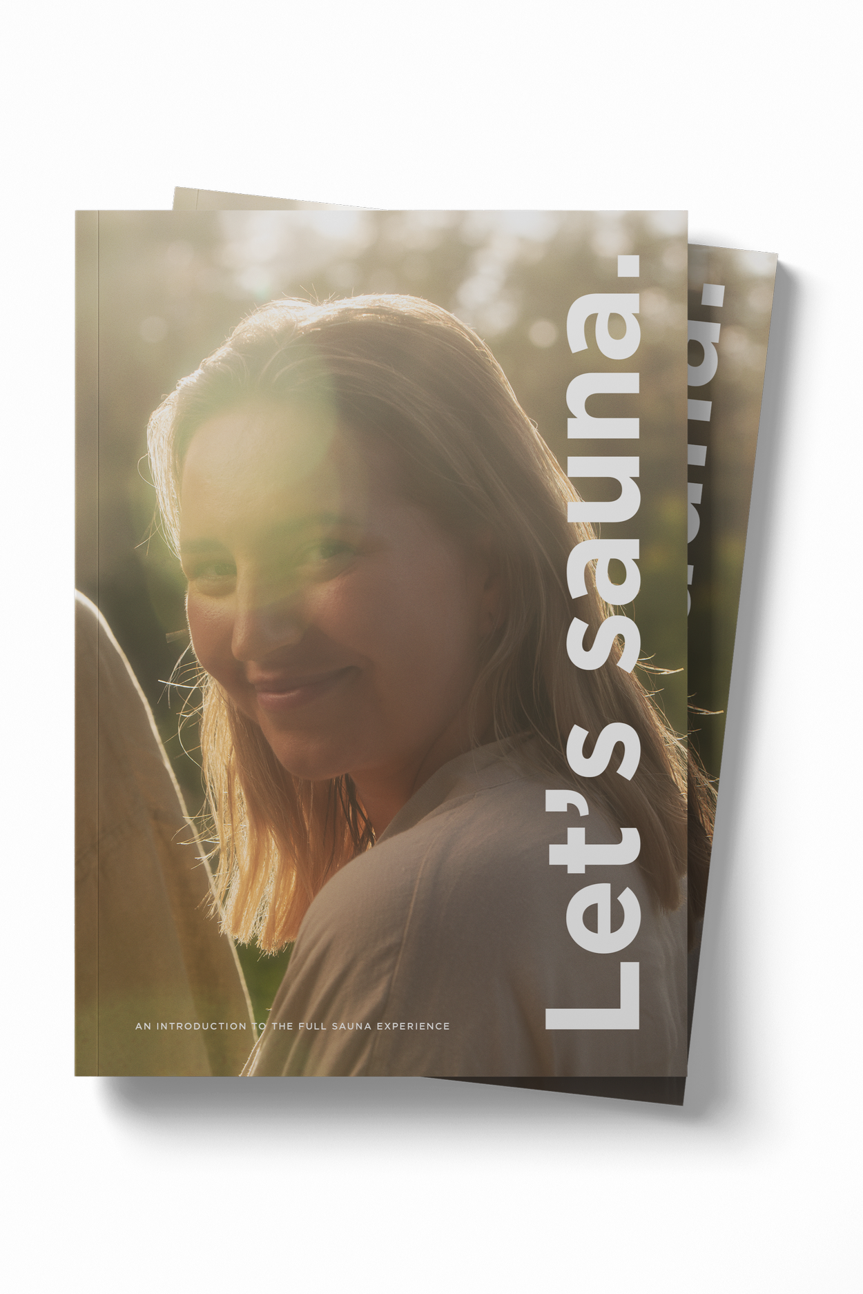
At the heart of the image concept lies the brand promise “Let’s sauna.” It celebrates the joy of shared experience and the sensory pleasure of sauna — before, during, and after.
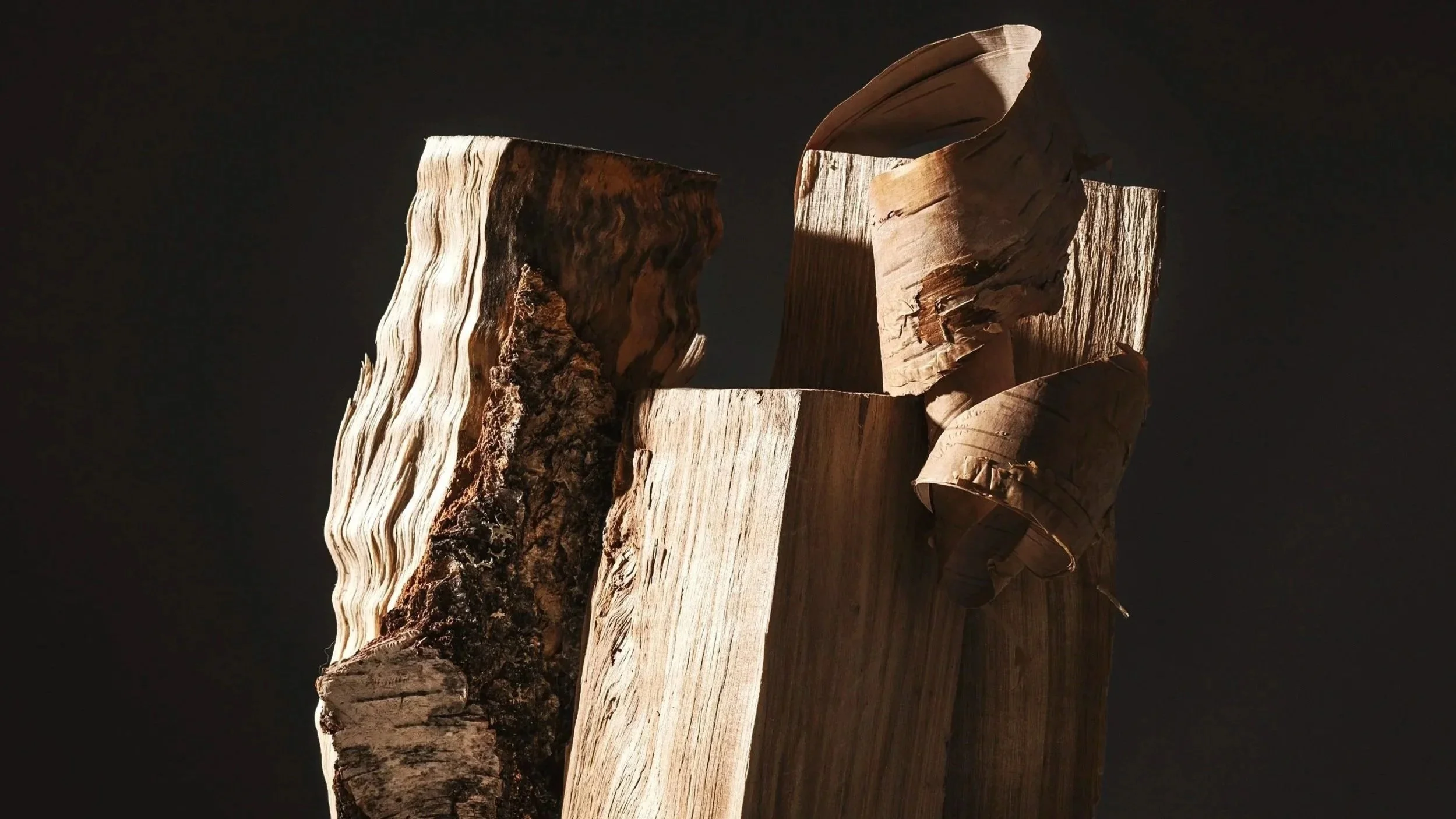
In the imagery, warmth becomes visible. Individual moments of presence meet shared experiences of joy.
Every element glows with the same energy that connects people through the ritual of sauna.
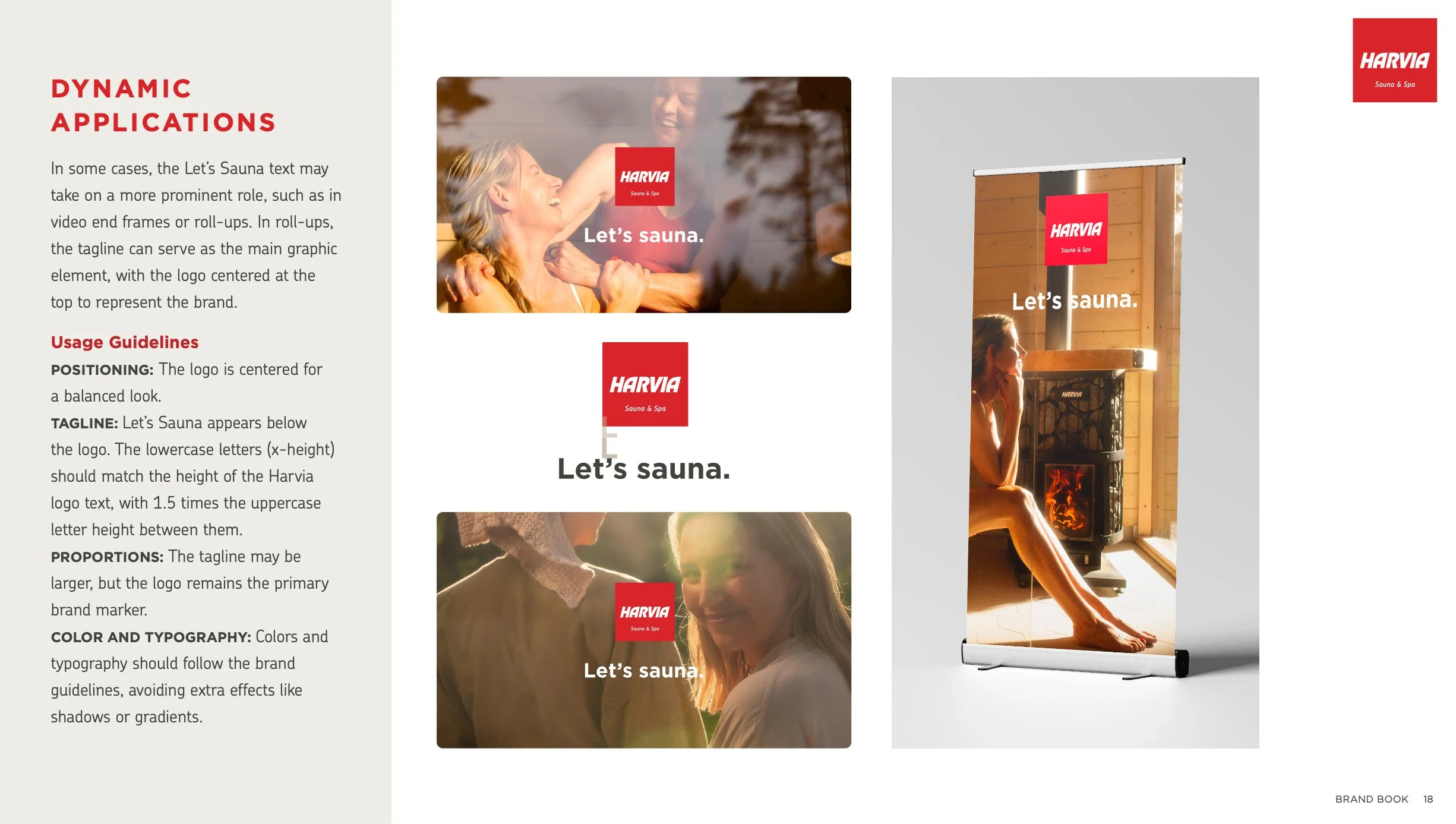
The identity was extended into dynamic applications for international trade fairs — from roll-ups and posters to large-scale spatial brand surfaces. Each execution carries the same clarity and warmth as the core identity, ensuring a confident and cohesive brand presence across diverse environments.
The identity came to life through a comprehensive Brand Book, a multilingual Let’s Sauna booklet, and a cinematic brand film — uniting strategy, emotion, and design into one radiant global expression.
Photography by Johanna Rontu and Olli Häkkinen / Ääri
Video production by Ääri
Services
Visual Identity / Creative Direction / Image Concept / Booklet Design / Spatial Brand Applications
Harvia brand film – Let's sauna.